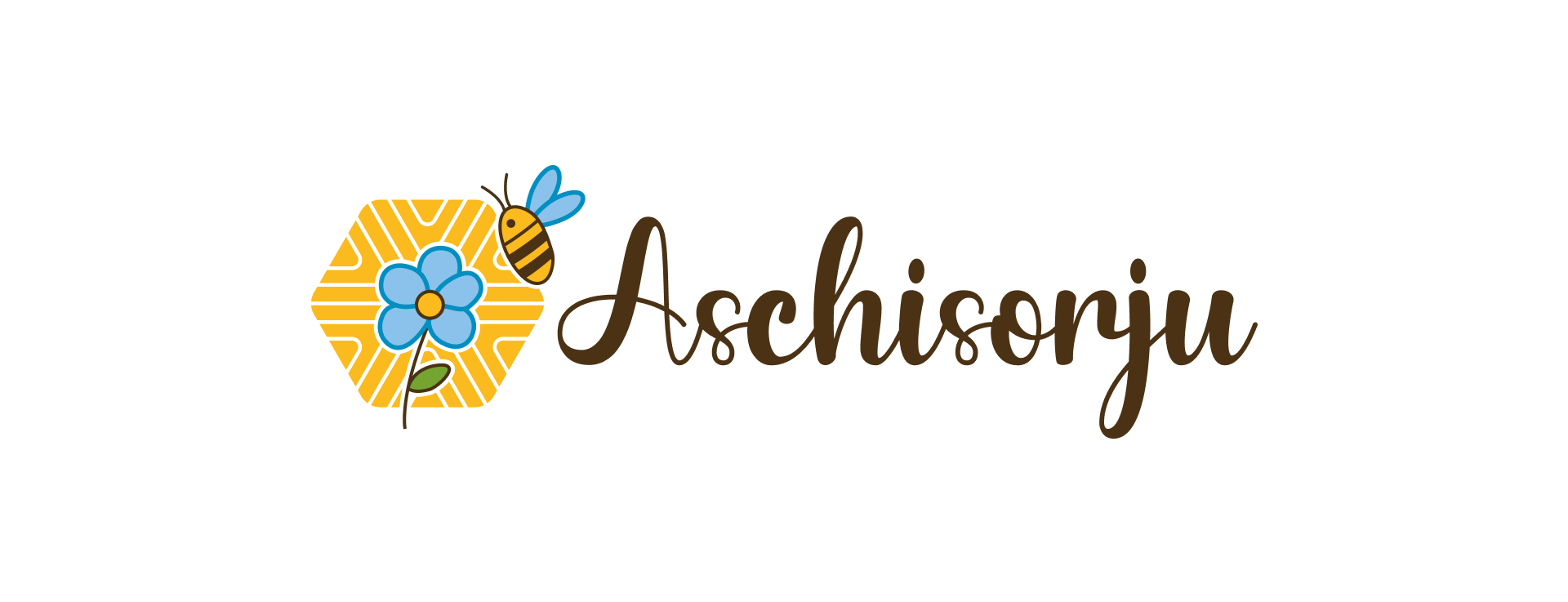
The Aschisorju brand combines three key elements: the honeycomb, symbolizing honey production; the pintadera, a Nuragic artifact reflecting its Sardinian roots; and the bee and flower illustration, a long-standing emblem of Aschisorju honey. Together, these elements create a simple, evocative brand that represents the product and its origins.
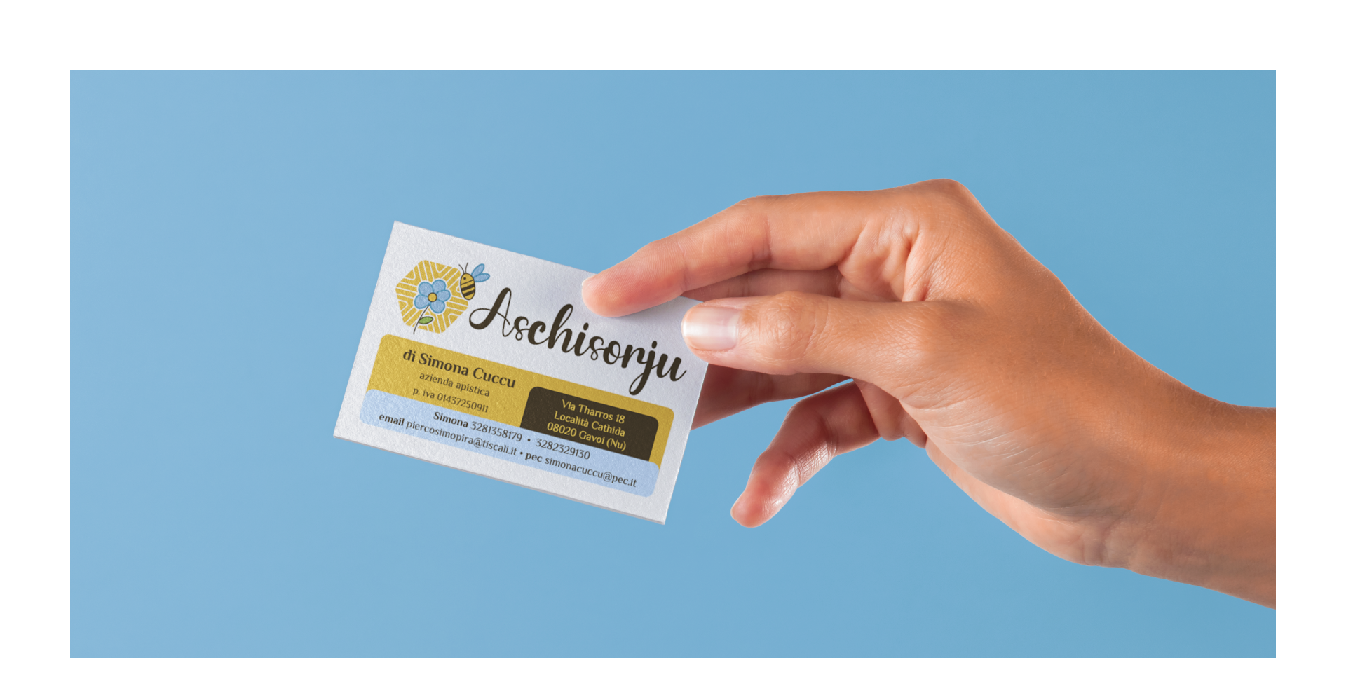
The brand’s design ensures immediacy: it’s instantly recognizable as a beekeeping company and recalls Sardinia's heritage through the pintadera motif. Accompanying the symbol is the logotype "Aschisorju," written in the handcrafted-style Chocolate typeface, reflecting the company’s values of tradition, simplicity, and craftsmanship.
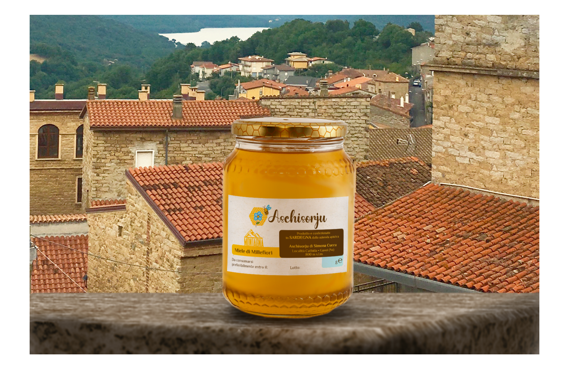
This design forms the basis for Aschisorju’s new labels, featuring a minimalist approach with three colors: yellow (honey), brown (earth/territory), and blue (the flower in the symbol). The Mountain Product certification logo integrates seamlessly into the design, appearing on the front and back of the labels. This cohesive branding introduces Aschisorju’s artisanal essence to new customers with simplicity and authenticity.
The brand’s design ensures immediacy: it’s instantly recognizable as a beekeeping company and recalls Sardinia's heritage through the pintadera motif. Accompanying the symbol is the logotype "Aschisorju," written in the handcrafted-style Chocolate typeface, reflecting the company’s values of tradition, simplicity, and craftsmanship.
This design forms the basis for Aschisorju’s new labels, featuring a minimalist approach with three colors: yellow (honey), brown (earth/territory), and blue (the flower in the symbol). The Mountain Product certification logo integrates seamlessly into the design, appearing on the front and back of the labels. This cohesive branding introduces Aschisorju’s artisanal essence to new customers with simplicity and authenticity.